Adding a blog to this site has effectively doubled the number of page layouts I use - only from 2 to 4, but it still puts some strain on the very lean typographic system I’ve been using.
Deepseek did a pretty good job of keeping the general vibe of the site, and didn’t introduce anything unexpected in the CSS - in fact it’s maintained my style of writing CSS and HTML so far. It’ll be interesting to see how this continues as I add more features.
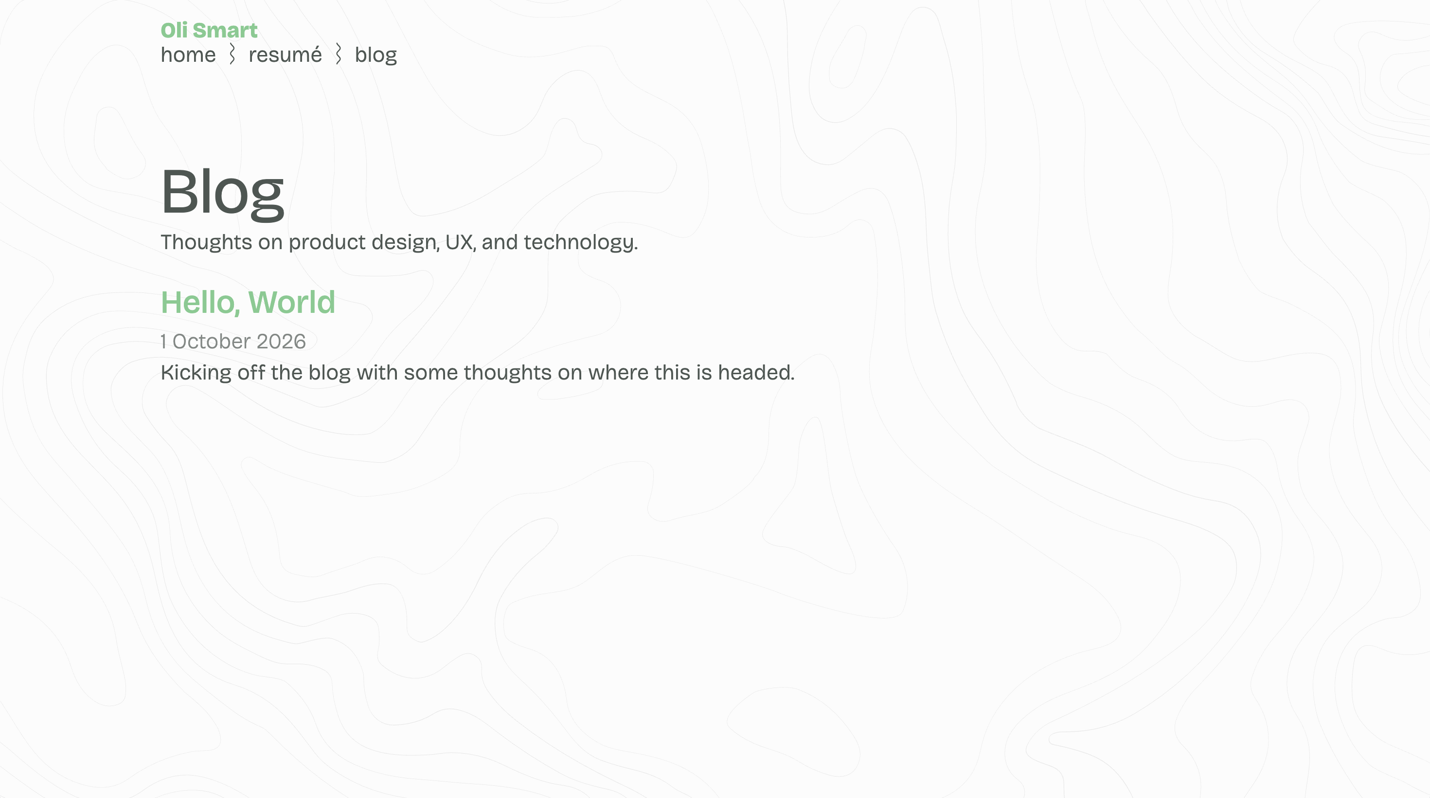
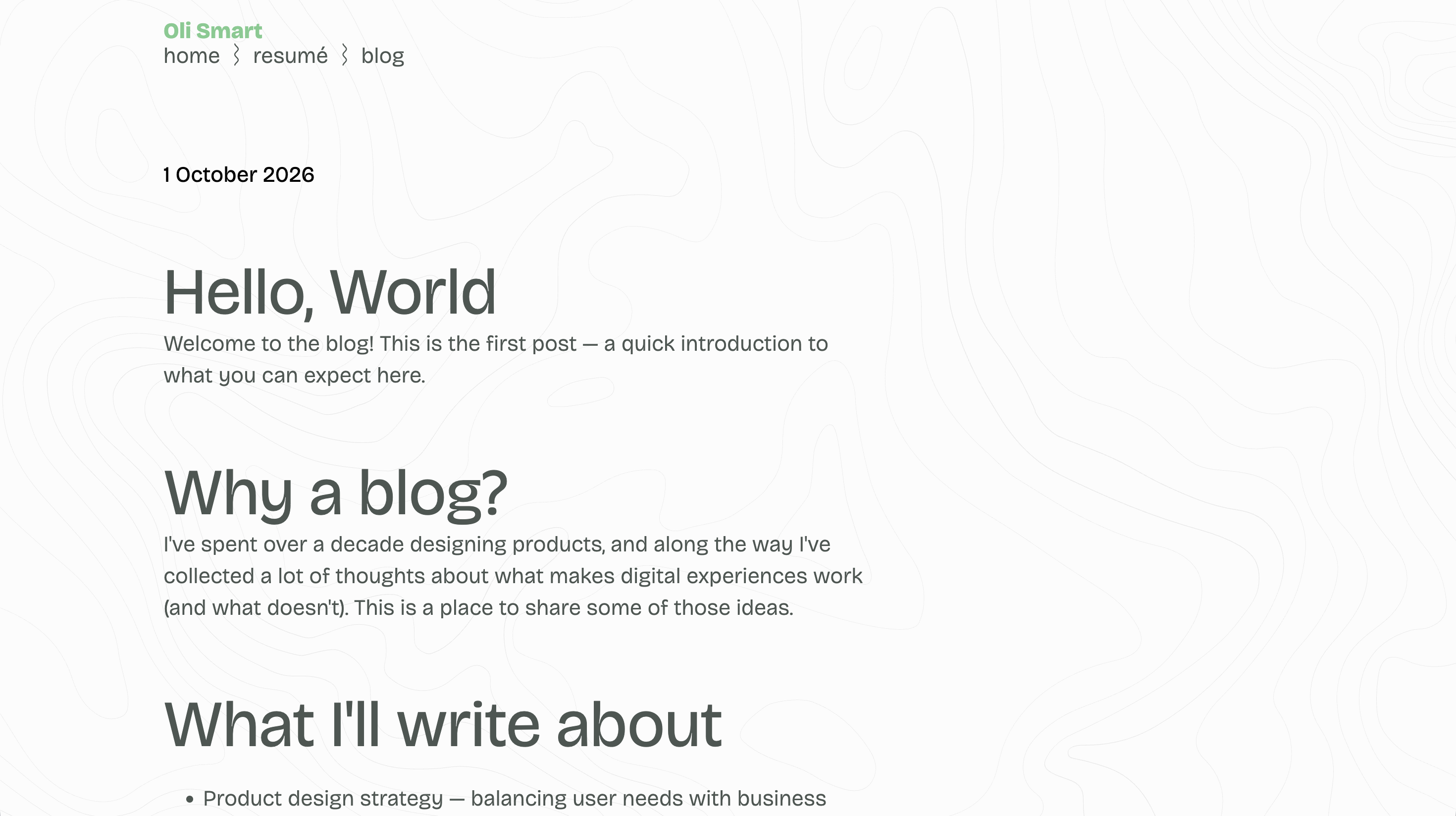
Looking at the code, I could see that a lot of the issues came from overly broad CSS classes - such as .item h2. Scoping the page specific layouts more closely quickly solved that but I suspect I’ll need a more comprehensive approach to typography if I want to stay in control.
One other issue these changes created was some inconsistencies in colour use; I originally used my accent colour for links, but also for some more ‘decorative’ touches. I always try and use a single colour to signal interactive elements as much as possible, so I stripped back colour from any headings that weren’t tappable and applied global CSS rules for links (no need for buttons…yet).
Accessible sites should always try and use something other than just colour to signal interactivity, so I also wanted to make links very clear. The veritable underline is probably the most universally understood pattern for this, but it’s a bit dull isn’t it?
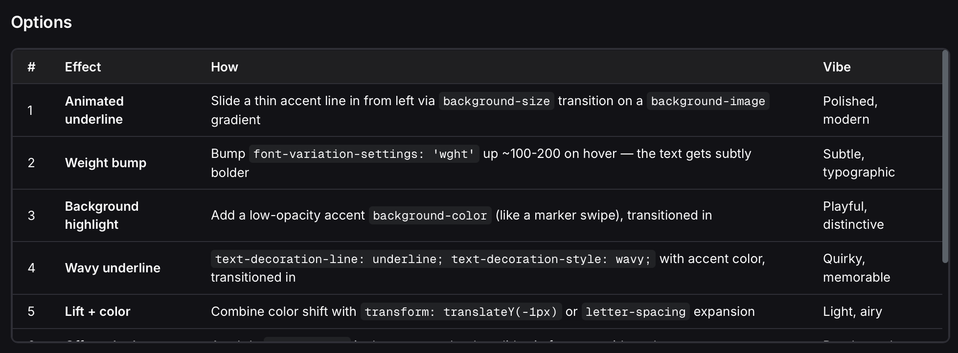
So I asked my IDE for a few ideas to jazz this up. One that caught my eye was text-decoration-style: wavy; - it’s been valid for most browsers since 2019 or so, but it’s a change I’d missed. Let’s try it!
Being a wave, it immediately made me think of how I might animate it. I was imagining the movement of a standing wave - where the peaks move from left to right - so that’s exactly what I asked for.
Surprisingly this caused a bit of a meltdown. Deepseek tried a few options, and couldn’t get past a problem with the ‘end state’ of the animation (I’ve got a screen cap video of this but the blog doesn’t support video yet). A few cycles of this and I’d burnt through more tokens than I’ve used for everything else so far.
A good reminder of how quickly token costs can go up due to styling decisions, so I reverted to the standard wavy underline for now. I may will revisit this in the future with a clearer brief for the LLM.